How Color Psychology Shapes Interior Spaces
Key Takeaways
- Colors significantly impact mood and atmosphere in interior design.
- Warm colors like red and orange stimulate energy and conversation.
- Cool colors such as blue and green promote calmness and relaxation.
- Neutral tones provide versatility and balance in design schemes.
- Strategic color placement can alter the perception of space size and shape.
Table of Contents
- Introduction
- Warm Colors: Energize and Invigorate
- Cool Colors: Calm and Soothe
- Neutral Tones: Balance and Versatility
- Color Placement and Spatial Perception
- Lighting and Color Interaction
- Cultural Influences on Color Perception
- Current Trends in Color Psychology
- Conclusion
Color is more than just a visual choice; it deeply influences how we feel, behave, and even interact in our environments. Whether you are refreshing a single room or embarking on a full home makeover, understanding color psychology can help cultivate the atmosphere you desire. The impact of choosing the right hues is profound, from sparking creativity to encouraging relaxation. If you are looking for guidance, a professional painting company Kansas City can help translate your vision into reality through thoughtful color selection.
Every color in your palette can influence perceptions and atmosphere within a space. Strategic use of color can enhance small rooms, create cozy environments, or boost productivity in home offices. Beyond their functional roles, colors express personality and connect with visitors. As you update your interiors, consider how paint transforms your home’s character by understanding hue interactions with light and cultural context. The psychology of color transcends trends, enabling informed choices that enhance the aesthetics and emotions of various styles.
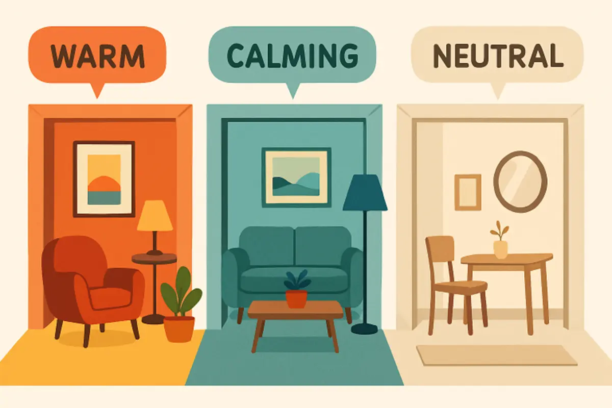
Warm Colors: Energize and Invigorate
Red, orange, and yellow, often classified as warm hues, are attention-grabbing and brimming with energy. These colors are ideal for spaces where stimulation and socialization are key objectives. For example, a splash of vibrant red can encourage lively conversation in a dining area, while deep orange tones invite warmth into entryways or kitchens. However, balance is important. Excessive saturation can feel overwhelming, so consider pairing these shades with softer neutrals to maintain harmony.
Besides their ability to animate a room, warm colors can create a sense of intimacy. In climates with long winters or limited natural light, incorporating warm hues can counteract dullness and create a sense of coziness in your interiors, turning a simple gathering spot into the heart of your home.
Cool Colors: Calm and Soothe
Blues and greens embody relaxation and tranquility. These colors mimic the calming effects of sky and foliage, making them perfect choices for bedrooms, bathrooms, or reading nooks where serenity is desired. Soft blue walls can soothe the mind, help lower stress, and even promote better sleep. In workspaces, muted greens or aquatic tones foster focus and reduce visual fatigue, blending both function and comfort in a single stroke.
When used in larger areas, cool hues can make a room feel more spacious and light. Their subtlety and depth also lend themselves to layering, allowing for thoughtful combinations of shades and textures. Cool palettes are often recommended for homes seeking a peaceful retreat-like vibe in a fast-paced world.
Neutral Tones: Balance and Versatility
Neutral shades play a foundational role in design. White, gray, beige, and taupe offer a timeless quality that suits nearly every style and taste. These colors are prized for their ability to make rooms feel expansive and uncluttered, acting as a canvas for both classic decor and bold accents. Neutrals also provide a sense of cohesion, effortlessly linking different rooms and design elements throughout your home.
Designers turn to neutral tones not just for their adaptability but also for their subtle sophistication. A nuanced gray, for instance, can evoke both modern minimalism and quiet luxury, while soft beige imparts warmth without overwhelming the senses. As a bonus, neutrals allow for seasonal or trendy color changes in accents and accessories, maximizing your creative flexibility.
Color Placement and Spatial Perception
How and where color is used can dramatically affect a room’s perceived size and shape. Light shades visually expand spaces, making them an optimal choice for smaller rooms or those with minimal natural light. Conversely, darker tones can envelop a space, introducing intimacy and drama. This contrast gives homeowners and designers flexibility to accentuate or downplay features based on personal style and architectural characteristics.
Techniques such as painting ceilings lighter than the walls can raise the apparent height in a space. Strategically placed accent walls or bold color blocks can help define specific zones within an open concept layout, providing structure without the need for physical dividers.
Lighting and Color Interaction
The interplay between color and lighting is crucial. Natural sunlight reveals a hue’s true intensity, sometimes shifting its undertones throughout the day. Artificial lighting, on the other hand, can either highlight or significantly alter a color’s appearance. Warm bulbs can add depth to reds and yellows, while cooling lights can make blues feel sharper and whites starker.
Before committing to a color, it is wise to test samples under multiple lighting conditions. Observe how morning, afternoon, and evening light affect the palette to avoid surprises after the painting is complete. This careful consideration helps achieve the precise atmosphere and aesthetic you envision for your interiors.
Cultural Influences on Color Perception
Color meanings are not universal. Cultural backgrounds shape the way we perceive and respond to different hues. While white signifies purity and new beginnings in many Western societies, it can be linked to mourning or loss in certain Eastern cultures. Red may symbolize luck and celebration in some regions, but elsewhere it can be interpreted as a warning or a sign of danger.
When designing for multicultural environments or shared spaces, being mindful of these variations in color perception is vital. It invites inclusivity and ensures that design choices resonate positively with everyone who experiences them.
Current Trends in Color Psychology
The world of interior color design is constantly evolving. Lately, nuanced white shades layered with subtle undertones have grown in popularity. These colors respond dynamically to light changes, resulting in spaces that shift their vibe from dawn to dusk. Designers increasingly favor soft, organic palettes that balance individuality and tranquility. Earthy greens, chalky blues, and sun-washed terra cottas also reflect a broader shift towards biophilic design, rooting interiors in nature-inspired calm.
In addition, bold accent walls and playful contrasts are reemerging, especially in artistic or lively family homes. This trend combines function with flair, using color psychology to shape environments that are both inviting and expressive.
Conclusion
Harnessing the principles of color psychology empowers you to create living spaces that are not just visually pleasing but also emotionally supportive. Every hue, placement, and finish contributes to your home’s story, ultimately shaping the feelings and experiences of everyone who crosses its threshold. Thoughtful paint decisions are the simplest route to a harmonious environment, merging scientific understanding with personal style for results that inspire, relax, and delight in equal measure.
Also read