Austin Screen Printing Explained: From Design to Final Product
Do you know that sinking feeling when you get promotional t-shirts for your event that look nothing like what you expected? The colors are off, the design is crooked, and after one wash, the whole thing starts peeling. Been there.
Most Austin businesses don’t realize they’re setting themselves up for disappointment before they even place their first Austin screen printing order. The problem isn’t the printing method – it’s that nobody explains how this stuff actually works.
Screen printing gets a bad rap because people compare it to those heat transfer vinyl decals you can make at home. That’s like comparing a food truck burger to what you get at a steakhouse. Same basic concept, totally different execution.
The Real Story Behind Screen Printing
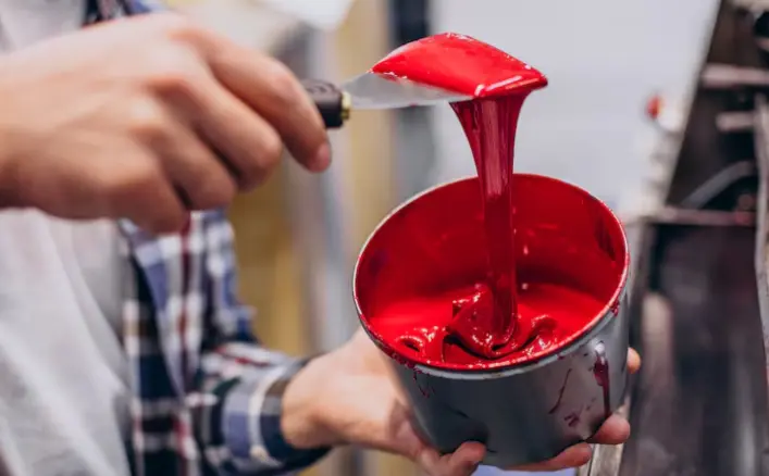
Walk into any professional shop and you’ll see screens stretched tight over wooden frames. Each screen has a stencil burned into the mesh. Think of it like a costly coloring book – the ink only goes where the stencil allows.
Every single color needs its own screen. Red logo with blue text? Two screens. Add a yellow border? Three screens. This drives the cost up fast, which explains why shops push you toward simpler designs.
The mesh itself comes in different densities. Fine mesh is used for detailed work, and coarse mesh is used for heavy ink coverage. Getting this wrong ruins everything, but most customers never hear about mesh count until something goes sideways.
Then there’s the squeegee work. You can’t just dump ink and push it around. The angle, pressure, and speed all affect how the final print looks. Too much pressure and the ink bleeds. Too little and you get patchy coverage.
Why Your Design Might Not Work
That logo you made in PowerPoint probably won’t translate well to fabric. Computer screens show millions of colors, but screen printing works best with solid, distinct colors.
Gradients cause headaches. Those smooth color transitions require special techniques that cost extra and don’t always look right. Most shops will try to talk you out of gradients, and they’re usually right.
Small text disappears on fabric. What looks readable at a 12-point font on paper becomes a blob of ink on a shirt. Sans-serif fonts work better than those fancy scripts you see on wedding invitations.
Here’s something nobody mentions upfront: dark shirts need special treatment. Printing light colors on dark fabric requires an underbase layer of white ink first. Otherwise, your bright red logo turns into dark burgundy.
The plastisol ink used in most shops sits on top of the fabric rather than soaking in. This creates that slightly raised feel you get on quality prints. Some people love it, others find it too thick.
Setup Costs Hit Different
Every design needs screens made. This setup process costs the same whether you’re printing 20 shirts or 200. The math gets ugly fast on small orders.
Most shops have minimum quantities for this reason. They’re not being difficult – they literally lose money on tiny orders. Those “print on demand” services use different methods specifically to avoid setup costs.
Custom colors add another layer of complexity. That specific shade of blue that matches your brand? The shop needs to mix ink specially for your job. Standard colors cost less because they are bought pre-mixed in bulk.
Screen setup time varies based on design complexity. Simple single-color jobs might take an hour. Multi-color designs with tight registration can take half a day just for prep work.
Material Choices Matter More Than Price
Cheap shirts feel cheap. Your customers notice the difference immediately. That thin, scratchy fabric screams, “We spent as little as possible on this.”
100% cotton shrinks unpredictably. Cotton blends hold their shape better but don’t breathe as well. Polyester blends print beautifully but can feel synthetic against skin.
Shirt weight gets measured in ounces per square yard. Anything under 4.5 oz feels flimsy. Premium shirts run 6+ oz and cost significantly more, but the quality difference is noticeable.
Color selection affects printing costs, too. Printing white ink on black shirts requires the underbase layer we mentioned. Light colors on light shirts print more easily and cheaply.
What Goes Wrong and Why
Temperature control during curing makes or breaks the job. It is too hot, and the shirts shrink in the dryer. It is too cool, and the ink doesn’t bond properly, leading to cracking and peeling.
Registration problems happen when screens don’t line up perfectly. Your two-color design ends up with a shadow effect where the colors don’t quite meet. Good shops catch this during printing, but mistakes slip through.
Ink viscosity changes with temperature and humidity. That perfect print run in the morning might need adjustments by afternoon. Experienced operators know how to compensate.
Rush jobs increase error rates. When shops scramble to meet tight deadlines, quality control suffers. Planning ahead prevents most disasters.
Time Expectations vs Reality
Standard turnaround runs 7-10 business days from approved artwork. Custom colors add time. Special effects like discharge printing or water-based inks extend timelines further.
Busy seasons crush most shops. Back-to-school, holidays, and local event seasons create bottlenecks. Shops that seem fast in February might take weeks in October.
Artwork approval delays everything. That design revision you requested? It pushes your delivery date back even if printing hasn’t started yet.
The Bottom Line
Screen printing creates lasting brand impressions when executed properly. The process combines technical precision with artistic vision to produce wearable marketing that actually gets used.
Understanding these behind-the-scenes details helps you make smarter decisions about design, quantity, and timing. Your finished shirts might look effortless, but quality results require careful planning and realistic expectations.
Also Read-How Cooperative Procurement Transforms Purchasing Power for Schools and Universities