Decoding the Sensex Heatmap: What the Colors Reveal?
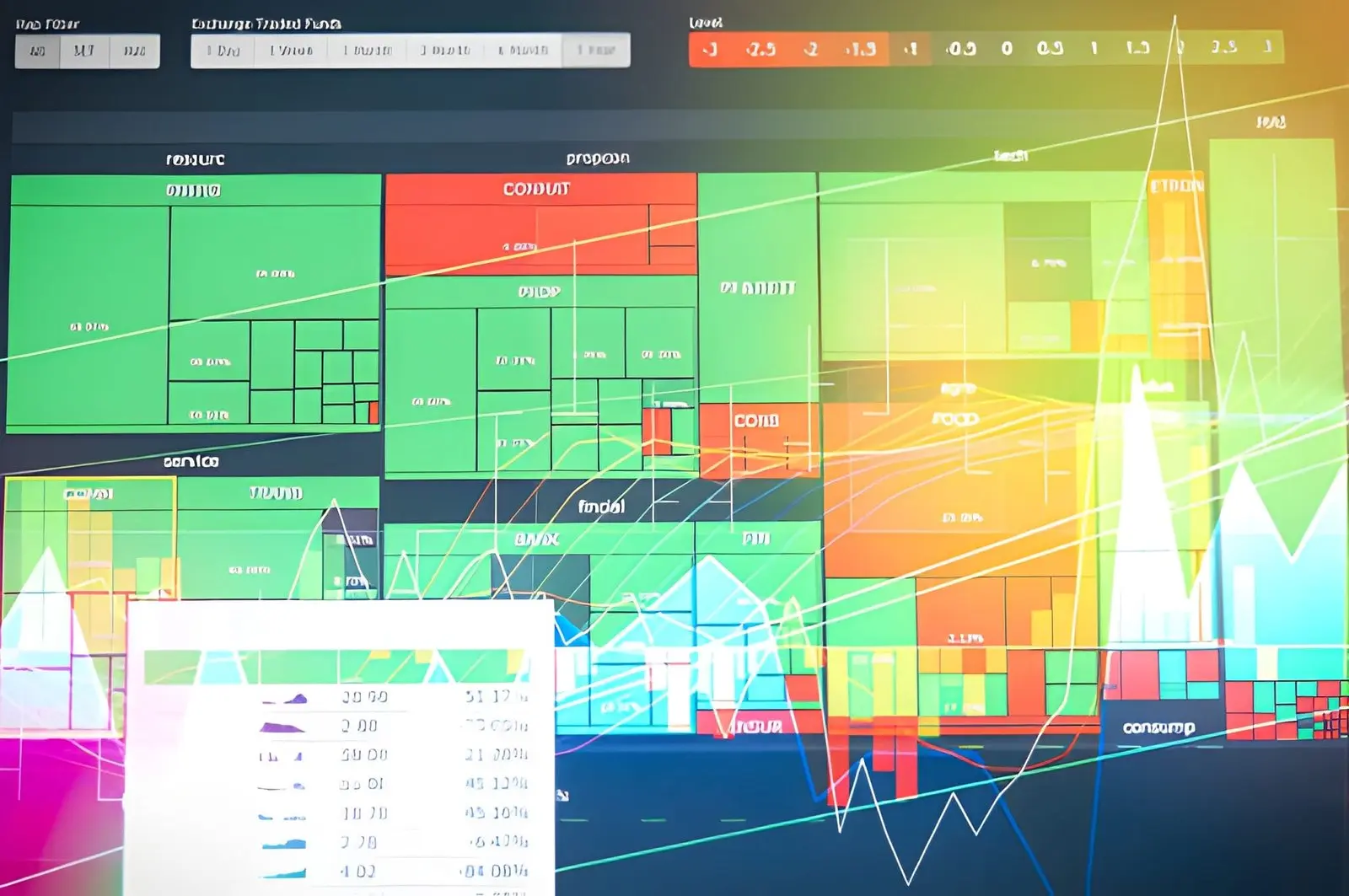
A Sensex heatmap is a visual dashboard that shows how each company within the Sensex index is performing at a given moment.
Instead of going through multiple data tables, traders can glance at the heatmap to understand market direction.
Each company is represented by a box, and its size often reflects the company’s weight in the index.
By looking at the overall pattern of colours, traders can identify which sectors are leading or lagging, making it easier to track broad trends and spot unusual movements efficiently. In this article, we will break down what these colours represent and how you can interpret them to make more informed investment decisions.
Heatmap Colour Coding Explained
Before exploring market patterns in detail, it is important to first grasp the colour scheme on the Sensex heatmap, because each shade carries its own subtle message about stock movements and helps set the foundation for interpreting broader trends with greater clarity and accuracy.
1. Green Shades: Indicators of Strength
Green shades in a Sensex heatmap suggest positive momentum. A lighter green signals modest gains, while darker green points to stronger upward movement.
For instance, if L&T share price rises from ₹3,650 to ₹3,800 during the session, its block would shift to a deeper green. That deep green tells viewers quickly that L&T outperformed many peers that day.
In practical terms, seeing multiple dark-green blocks in a sector hints that the entire sector is enjoying buying momentum.
2. Red Shades: Signs of Decline
Red on a Sensex heatmap highlights stocks that are losing value. A lighter red often reflects a mild fall, usually within a one percent range.
A deeper red signals a more significant drop. For example, if ABC Ltd. shows up in dark red while most of its peer stocks remain neutral or light green, it indicates that ABC is facing stronger selling pressure compared to its peers.
This visual cue helps traders quickly pinpoint areas of weakness in the market.
3. Neutral or Grey Shades: Stable Zones
Neutral or grey shades usually appear when a stock shows little to no price change during the trading session. These tones highlight stability rather than strong market sentiment.
For example, if a large company like Infosys ends the day with a 0.1% movement, its block on the heatmap would likely appear grey. Although these sections may not attract immediate attention, they offer useful clues.
Traders often review such areas to understand which stocks remain steady while the rest of the market moves in different directions.
How Traders Use the Heatmap
Understanding how traders interpret these visual cues is key to making sense of market movements. While each trader has a different strategy, the heatmap serves as a quick decision-support tool in several practical ways:
- Identifying overall sentiment: Traders glance at the dominant colour on the heatmap to gauge whether the market is leaning bullish or bearish. A sea of green often signals broad optimism, while red suggests widespread selling pressure.
- Spotting sector rotation: Grouped colour patterns help traders notice shifts between industries. For example, if technology turns green while financials fade, it may indicate capital flowing from one sector to another.
- Identify outliers: Sharp colour contrasts help highlight companies that are moving differently from their peers, often pointing to unique developments or breaking news.
- Track rotation patterns: They observe when strength fades in one sector while another begins to pick up, since these shifts often influence short-term strategies.
- Prioritise opportunities: The heatmap lets them focus quickly on meaningful moves, making it easier to decide where to allocate their time during active sessions.
Concluding
When traders look at the Sensex heatmap, they can pick up shifts in market sentiment and sector trends almost instantly. Paying attention to the colours and block sizes helps them notice what is moving without combing through detailed figures. It works best as a context that supports clear, informed decisions.
Also Read